
In-Film: Main Credits / DVD menus
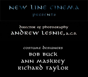
The font used for the main credits of the film (front titles as well as the main end credits) was created by the artists Sacha Winter and Alan Lee for The Lord of the Rings and reused for The Hobbit.
It has not been released publically and its name remains unknown. It is also used for several other purposes, e.g.:
- LOTR SEE / Hobbit SEE menus;
- LOTR SEE featurette titles;
- The Hobbit Video Blogs: “To Be Continued” etc.
There is an alternative by yours truly which is free for non-commercial use, called Aniron. It can be downloaded here.

In-Film: Elvish/Orkish Subtitles
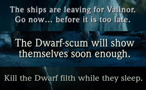
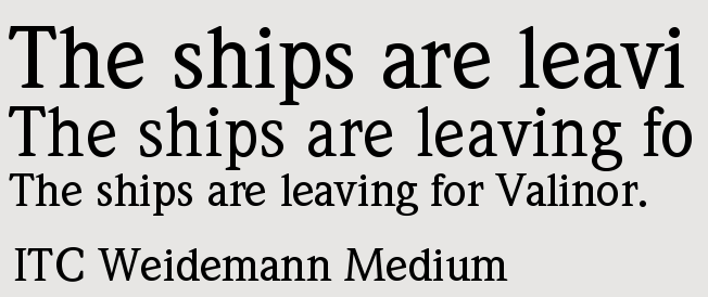
The font for Elvish subtitles in The Lord of the Rings as well as for Elvish / Orkish subtitles in The Hobbit is called ITC Weidemann Medium.
Note that “Weidemann” is German for “Man Willow” — a nice Tolkienesque touch 🙂 (although the font name actually comes from its designer, Kurt Weidemann).
The Hobbit: The Desolation of Smaug uses the same font, but slightly widened horizontally. It is available here.
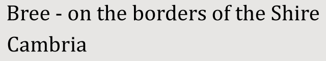
In-Film: Location subtitles (DOS)
![]()
As opposed to The Hobbit: An Unexpected Journey which used ITC Weidemann for locations as well as for subtitles, a different font was used for location inscriptions on The Hobbit: The Desolation of Smaug.
The font used there is Cambria and is in fact included with Microsoft Windows since Vista. You can download it here.
In-Film: Additional Credits (FOTR/TTT/AUJ/DOS)

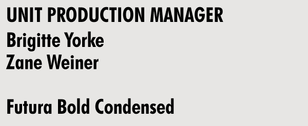
The font used for the rolling credit sequences in of The Fellowship of the Ring, The Two Towers, An Unexpected Journey and The Desolation of Smaug is Futura Bold Condensed.
The Futura font family is a geometric-looking serifless typeface developed in 1927 by the German font designer Paul Renner, and contains many elements from the Bauhaus design style. It is available here.
In-Film: Additional Credits (ROTK)
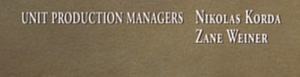
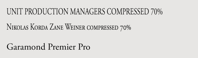
The Return of the King is different from the other installments as for inclusion of background artworks in the end credits sequence. The font used for the credits are from the Garamond family with additional vertical condensing (ca. 70%).
The Garamond font is a family of fonts used in the 16th century that were initially created by the French designer Claude Garamond or are based on his designs, e.g. by the 17th century designer Jean Jannon.
It is considered one of the most readable serif typefaces. The font looking most similar to the credits font is Adobe Garamond Premier Pro; you can get it here.
- Alan Lee
- Daniel Falconer
- Green Books
- Hobbit Movie
- John Howe
- LotR Movies
- Movie Fellowship of the Ring
- Movie Return of the King
- Movie The Two Towers
- The Hobbit
- The Hobbit: An Unexpected Journey
- The Hobbit: The Battle of Five Armies
- The Hobbit: The Battle of the Five Armies
- The Hobbit: The Desolation of Smaug
- The Hobbit: There and Back Again
- The Lord of the Rings
