
Marketing: Poster Taglines / Trailer Font
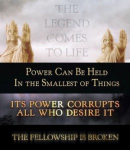
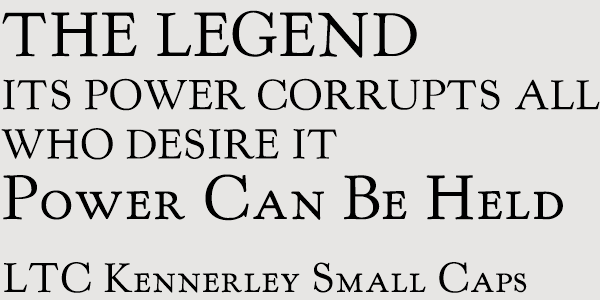
The font used for taglines on various Lord of the Rings posters and trailers is from the LTC Kennerley family.
The font author is Lanston Monotype Company, an American font type company based in late 19th century.
The actual font used for LOTR is LTC Kennerley Small Caps (there is also a similar font called Kennerley BQ). It is also used (in vertically compressed form) for the poster billing texts.
There is also a free alternative called KennerlyHSC; however, it is of lesser quality than the original which can be purchased here.
Marketing: Additional Poster Taglines
![]()
In a few instances, a different font was used — the omnipresent and ever-popular Trajan Pro. It was used on the second theatrical poster for The Two Towers (the one with Saruman overlooking his host).
Trajan is based on the Roman inscription typeface and was created by designer Carol Twombly for Adobe in 1989. You can get it here.

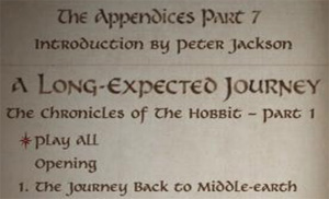
DVD menus and booklets (The Lord of the Rings)
The menus of The Lord of the Rings Theatrical Version DVDs as well as some of the menus in The Lord of the Rings Special Extended Edition are set with the font called Calligraphic 421 (also known as Calligraph 421) by Bitstream.
It is also used for the booklets of The Lord of the Rings SEE DVDs and BluRays.
However, this font does not seem to be used for The Hobbit marketing. You can get it here.

DVD/BluRay menus (The Hobbit)
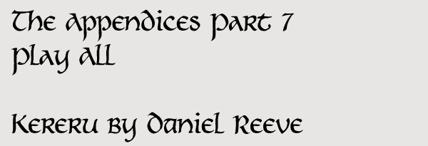
The menus of the bonus discs of the Extended Version of The Hobbit are set in a somewhat medieval-looking handwritten typeface.
This font was created by Daniel Reeve, calligrapher and cartographer of The Lord of the Rings and The Hobbit films; there is a publicly available commercial version of it called Kereru.
Some letters look different; however, the font provides alternative versions of several letters in order to make it look more Middle-Earthy. You can get it on Daniel Reeve’s website.
Closing words
There are doubltless many more typefaces not listed here. For instance, all the inscriptions in the movies themselves, be it in the language of Men, Dwarves or Elves — which were hand-drawn by the film’s calligrapher, Daniel Reeve. We can only hope that Mr. Reeve will release some of them as actual fonts some day.
So far, there are some fan fonts trying to fill this niche; some of them are collected on my website.
Anyway, with this guide (and a fistful of dollars) designers should be able to create more convincing-looking fan-art, especially fan posters. For example, this year’s April’s Fool on TORn, a fake end credits sequence of The Hobbit 3, was created using Aniron and Garamond Premier Pro.
TheHutt is chief editor of the Russian Lord of the Rings and The Hobbit site, Henneth-Annun.ru. He has created two LOTR fan fonts, Ringbearer and Aniron.
- Alan Lee
- Daniel Falconer
- Green Books
- Hobbit Movie
- John Howe
- LotR Movies
- Movie Fellowship of the Ring
- Movie Return of the King
- Movie The Two Towers
- The Hobbit
- The Hobbit: An Unexpected Journey
- The Hobbit: The Battle of Five Armies
- The Hobbit: The Battle of the Five Armies
- The Hobbit: The Desolation of Smaug
- The Hobbit: There and Back Again
- The Lord of the Rings
