
 In this feature Ringer TheHutt, who runs Russian Lord of the Rings and The Hobbit site Henneth-Annun.ru, delves into the different varieties used in Peter Jackson’s movies of The Lord of the Rings and The Hobbit.
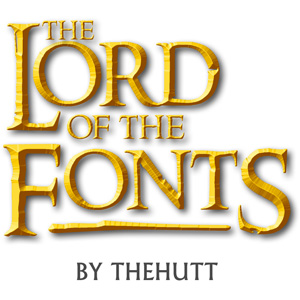
The Lord of the Fonts
A Lord of the Rings and Hobbit Font Guide
by TheHutt (Peter Klassen)
What would the Lord of the Rings trilogy be without its iconic logo? The chiseled yellow letters are pretty close to perfection where movie logos are concerned. But that’s not the only instance of certain characteristic typefaces used throughout the trilogy and its marketing. Most of them have recurred in the new Hobbit films – but what exactly are they and where can they be obtained?
Fonts do matter. Sometimes a correct typeface is the one thing that makes a difference between a promising, but rather obvious fan art and a professional-looking artwork. Being somewhat of a font designer myself, I am a bit geeky when typography is concerned. Therefore this guide: here I would like to present the most important fonts used for Peter Jackson’s Middle-earth films, both The Lord of the Rings and The Hobbit.
This guide is explicitly not about fonts for Tolkien languages (i.e. different Elvish, Dwarvish and other fonts) – this topic itself would be a vast field of research. The main focus is presenting the typefaces used for the movies as well as for their marketing (posters, trailers and so on).
I would like to separate the fonts used in the films themselves from the fonts used for marketing purposes, as these are basically different departments. “In-Film” marks the fonts used in the film itself, whereas “Marketing” labels the fonts used for posters, trailers and merchandizing. A separate category is used for usage on DVD/BluRay releases. The fonts are sorted in the order of relevance.
A note on piracy: I only provided links to commercial versions of the fonts. Some of the more popular fonts actually have legal free alternatives (as the look of a font is not protected by copyright); some are actually openly pirated on websites which I shall not utter here.
In-Film: Film Titles
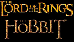
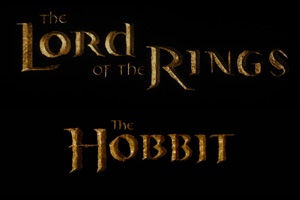 Unfortunately, there is no font for the actual film titles from the films (The Lord of the Rings, The Hobbit) themselves. The logos as well as their international versions were created by Alan Lee and are handwritten.
If one made the effort of collecting all the international logos of the films, one could probably make a font out of it.
In-Film: Part Titles
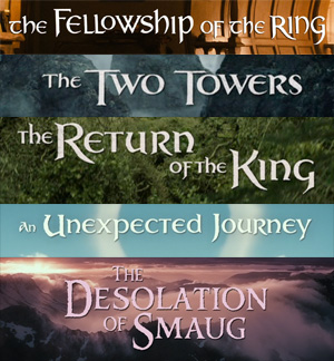
The logos for the each film part (The Fellowship of the Ring etc.) were hand-drawn by the films’ calligrapher, Daniel Reeve. Each part uses a different typeface (the only exception being Return of the King and An Unexpected Journey which actually share the same font) Also, The Desolation of Smaug film logo differs from the other logos created prior to it, as it was hand-drawn by Daniel Reeve, based actually on the Ringbearer font.
So far, there are no fonts in existence which could help replicating these titles. However, Daniel Reeve not only created all of the film part logos for LOTR, but also all the foreign-language versions of them. So strictly speaking, it would be theoretically possible to extrapolate enough characters from all the international logos to be able to create a proper font.
Marketing: Poster Film Titles
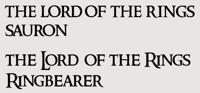
One of the most remarkable typefaces for Lord of the Rings/The Hobbit is the font used for the title of the films on posters, book covers, merchandizing articles etc.
This font is called Sauron and was created by The Ant Farm specially for the movies. In LOTR days, it was not widely used for other purposes than the film titles (however, it was also used for subtitles of the bonus features on LOTR SEE DVDs). For The Hobbit, it was used quite extensively for merchandizing articles. Note that the Sauron font is just a template font; for creation of the official movie logos in different languages the look of the letters was sometimes modified quite heavily.
For example, the two letters “B” in The Hobbit look very different from each other. It also contains small caps only (i.e. both upper and lower case letters look the same). This font is only available for NewLine/Warner’s merchandizing partners and is not available publicly.
There is an alternative to “Sauron” created by myself back in 2002, that is called Ringbearer Medium. To create it, I had to research international LOTR movie logos worldwide in order to determine the look of various letters. Some of the letters actually look different when compared to the Sauron font and/or the official logos of the film.
This font is free for non-commercial use and can be downloaded here.
Marketing: Poster Part Titles
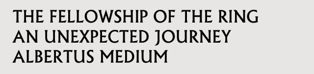
![]() The second important font for the LOTR movie posters is Albertus which is used for the titles of the separate parts, like The Fellowship of the Ring. This font was created by designer Berthold Wolpe and named after the German philosopher Albertus Magnus.
The second important font for the LOTR movie posters is Albertus which is used for the titles of the separate parts, like The Fellowship of the Ring. This font was created by designer Berthold Wolpe and named after the German philosopher Albertus Magnus.
There are several commercial versions of the font on the Internet; for instance, the versions by Linotype (available here) and by Monotype (available here).
There is also an alternative version called Flare Serif 821 BT Roman.
- Alan Lee
- Daniel Falconer
- Green Books
- Hobbit Movie
- John Howe
- LotR Movies
- Movie Fellowship of the Ring
- Movie Return of the King
- Movie The Two Towers
- The Hobbit
- The Hobbit: An Unexpected Journey
- The Hobbit: The Battle of Five Armies
- The Hobbit: The Battle of the Five Armies
- The Hobbit: The Desolation of Smaug
- The Hobbit: There and Back Again
- The Lord of the Rings
