 The extended edition for The Hobbit: An Unexpected Journey is, by now, well on the way. In this opinion piece, Ringer TheHutt offers his thoughts on how why the designers and creators at Warner Bros. should be taking their cues from the acclaimed success of The Lord of the Rings EEs, and not from the styling applied to AUJ’s theatrical edition.
WITH the theatrical home video release of The Hobbit: An Unexpected Journey the audiences witnessed something unique. Whereas usually a title gets released with a similar cover design throughout the world, the amount of different cover artworks, package types and release dates for TH:AUJ was overwhelming and distracting. The release date was somewhere between March (USA) and May (Australia, NZ) — more than a month’s span! Also, almost each country had its own cover artwork as well as additional editions (four steelbook editions in France alone!).
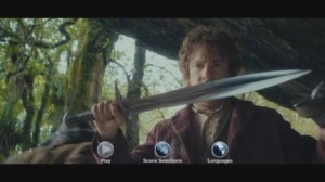
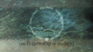
Despite this diversity of packaging, the release per-se made a rather cheap impression. The menu was just some uninspired collage with static subscreens, as opposed to the excellent LOTR TE DVD menus. Menus on non-US-releases were even worse: they had purple all-purpose buttons and Arial font on the menu points overlayed. The disc labels were simple black for the most countries AUJ was released in.
 As far as the SEE is concerned, we already have an announcement for a UK steelbook box, which for me is a clear hint that Warner Bros. still has no idea how to market this film, and is likely to continue the same approach with a multitude of different editions, packagings etc.
If you remember the theatrical DVDs for The Lord of the Rings, they all were quite similar in design. Also, they were released on a single day worldwide, even though the release was handled by many small release independent companies (as opposed to Warner Bros. who owns The Hobbit almost worldwide). They also had all the same menu designs.
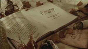
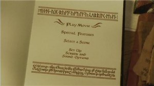
As I think, the basic idea behind the menu and package design of LOTR TE / LOTR SEE on DVD was to give the audience a feeling of an “exquisite framing” for the content by assessing what the makers of the discs would like to see themselves. For instance, animated menus can be very annoying if you have to navigate through several screens of them, and have overlong transitions between these screens. On LOTR the transitions are still there but they are meticulously timed to be not intrusive. And the menus are done in such a stylish and elegant way that it is a joy just watching them.
 Also, considering the package design: if anyone still owns the LOTR SEE DVD (as I do) — they are still a pleasure to hold in the hand, a truly elegant design made for collectors. (There was some difference between the normal SEE editions and giftset SEE editions in Europe where the normal SEE was made of thinner cardboard — however, the design and the gold lettering were still the same). And the SEE is, in fact, targeted at collectors as opposed to the majority who is just happy with the TE.
What I suggest:
There should be just one great design for the SEE, like it was the case with the LOTR SEE DVD editions. Or two variations of this design — for there should be a LOTR-like giftset as well. One which would deserve this name.
 This package design should mirror the design of the available LOTR SEE DVDs (not the BluRays, mind you – they suck in comparison).
The menus should reflect the same approach the LOTR SEEs used to have. Michael Pellerin is already involved in the documentaries — let him do the production for the SEE as well! The menus of the LOTR SEE DVDs were state of the art in terms of elegance, the amount of thought put into programming and the structuring of the bonus features. Although animated, the menus were never annoying.
Also, there should be no qualitative difference between English-language menus and non-English menus — that’s cheap.
By doing this, Warner Bros. would show:
* That the label actually knows what it does when it tries to market The Hobbit;
* That it recognizes that the target area for the SEE are collectors who mind such aspects;
* That it cares about giving the target audience what it wants: excellent content put into an exquisite framing;
* That the label releasing the SEE is not cheap.
TheHutt runs the Russian language LOTR and Hobbit site Henneth-Annun.ru. His opinions do not necessarily constitute those of TheOneRing.net or its staff.


